Web 4
Improbanden
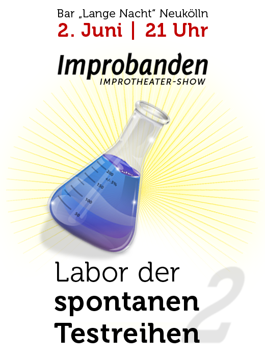
Corporate Design for my Berlin Neukölln based improv theatre group "Improbanden". The name plays with 2 german words impro and test person. Making decissions is a important thing in improv. So the logo with the 2 pills stand for the choise of the test person - blue or red.
And of course, there is a little quote from the Movie "The Matrix" inside. Morpheus says: "This is your last chance. After this, there is no turning back. You take the blue pill - the story ends, you wake up in your bed and believe whatever you want to believe. You take the red pill - you stay in Wonderland and I show you how deep the rabbit-hole goes."
Wikipedia says: The red pill and its opposite, the blue pill, are pop culture symbols representing the choice between the blissful ignorance of illusion (blue) and embracing the sometimes painful truth of reality (red).
The Improbanden play shows on stage and on festivals with theatre sport games, comedy and szenes and are open for experiments with media, Twitter, etc. Especially a longform is in development with test persons in different laboratories.

More about the improv group at www.improbanden.de
Skilly
Skilly was a job portal with the idea of social networks - in 2004. I created a special logo type named Skillsy, tough and robust, but also dynamic and stylish. Unfortunatly it was not an easy time for startups to find venture capital, so after 6 month the project died. And I never has finished the font.

Mischief Moose Manor
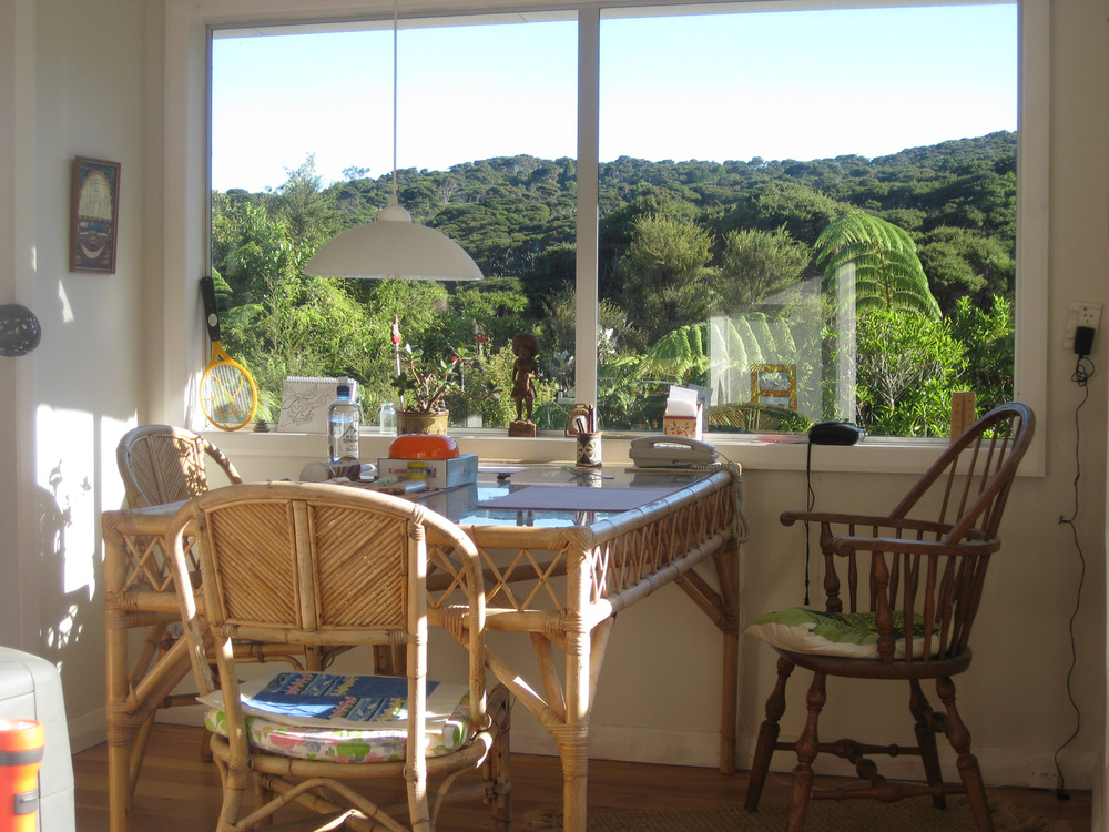
Logo and a Wordpress theme for Mischief Moose Manor, a subtropical jungle villa wide away on Great Barrier Island, New Zealand. Small functionality, easy contact and booking possibilities. The pictures of that manor are amazing. I want to book it too.
