Corporate 10
Improbanden
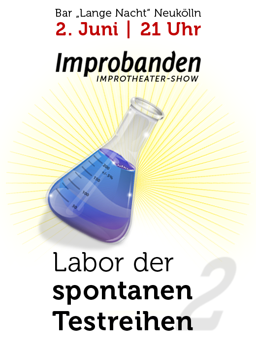
Corporate Design for my Berlin Neukölln based improv theatre group "Improbanden". The name plays with 2 german words impro and test person. Making decissions is a important thing in improv. So the logo with the 2 pills stand for the choise of the test person - blue or red.
And of course, there is a little quote from the Movie "The Matrix" inside. Morpheus says: "This is your last chance. After this, there is no turning back. You take the blue pill - the story ends, you wake up in your bed and believe whatever you want to believe. You take the red pill - you stay in Wonderland and I show you how deep the rabbit-hole goes."
Wikipedia says: The red pill and its opposite, the blue pill, are pop culture symbols representing the choice between the blissful ignorance of illusion (blue) and embracing the sometimes painful truth of reality (red).
The Improbanden play shows on stage and on festivals with theatre sport games, comedy and szenes and are open for experiments with media, Twitter, etc. Especially a longform is in development with test persons in different laboratories.

More about the improv group at www.improbanden.de
Skilly
Skilly was a job portal with the idea of social networks - in 2004. I created a special logo type named Skillsy, tough and robust, but also dynamic and stylish. Unfortunatly it was not an easy time for startups to find venture capital, so after 6 month the project died. And I never has finished the font.

Sun And Stars
Quick logo design for Sun And Stars. In one night from start to finish. It should contains stars and a sun, because these metaphers will also used in the communication. And it is an organisation for better energy concepts, so the flower or windmill shape fits.

Telekommunisten
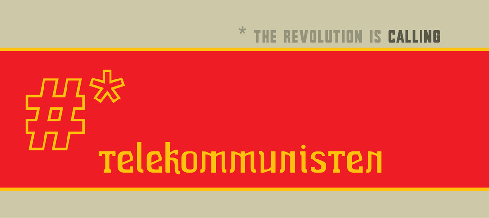
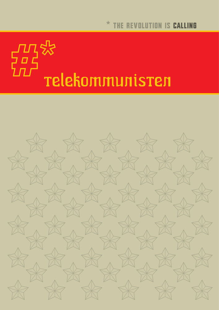
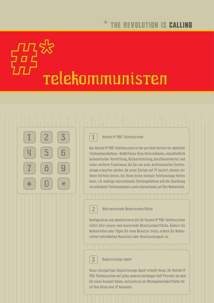
Logo and CD for Telekommunisten - The Revolution Is Calling.
Telekommunisten think in a different way: Worker Owned and Operated and they introduce the Prototyping of Venture Communism. The first collective investment product is Dialstation, which allow any land line or mobile telephone to make very inexpensive international phone calls.
Phuturity now!
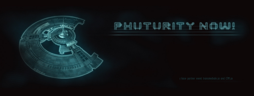
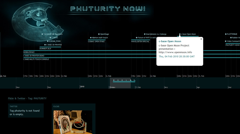
Art design and Microsite for Phuturity Now! in cooperation with Gregor Sedlag. It was an official partner event of the transmediale.10 and Club Transmediale. 5th time in a row that c-base hosted the transmediale partner event. transmediale is an annual festival for art anddigital culture. Visual tags: Speculative, Fictitious and Futuristic Art and Design. The microsite is a javascript based timeline.
https://www.c-base.org/transmediale/10/
Open Moon
Corporate Design for the c-base Open Moon Project. Open Moon is one of the official Google Lunar X-Prize competitors, a race to the moon. Open Moon will demonstrate that the community creating wikipedia is able to fly to the moon.
Commoonity into space means: Your engagement defines our future in space.
Join the revolution.

RSSmemo
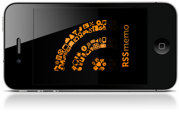
Splash screen and some icons for a litte iPhone app. It is a RSS reader with translation functionality. Intension is to push the learning of a new language. Mike is waiting for App Store approval.
UPDATE: It is now in the App Store: https://itunes.apple.com/app/rssmemo/id395588706?mt=8/
Mischief Moose Manor
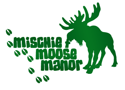
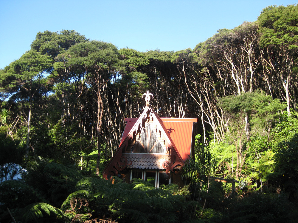
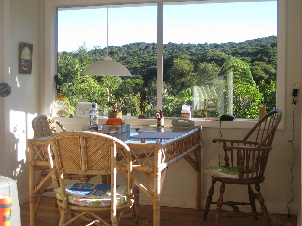
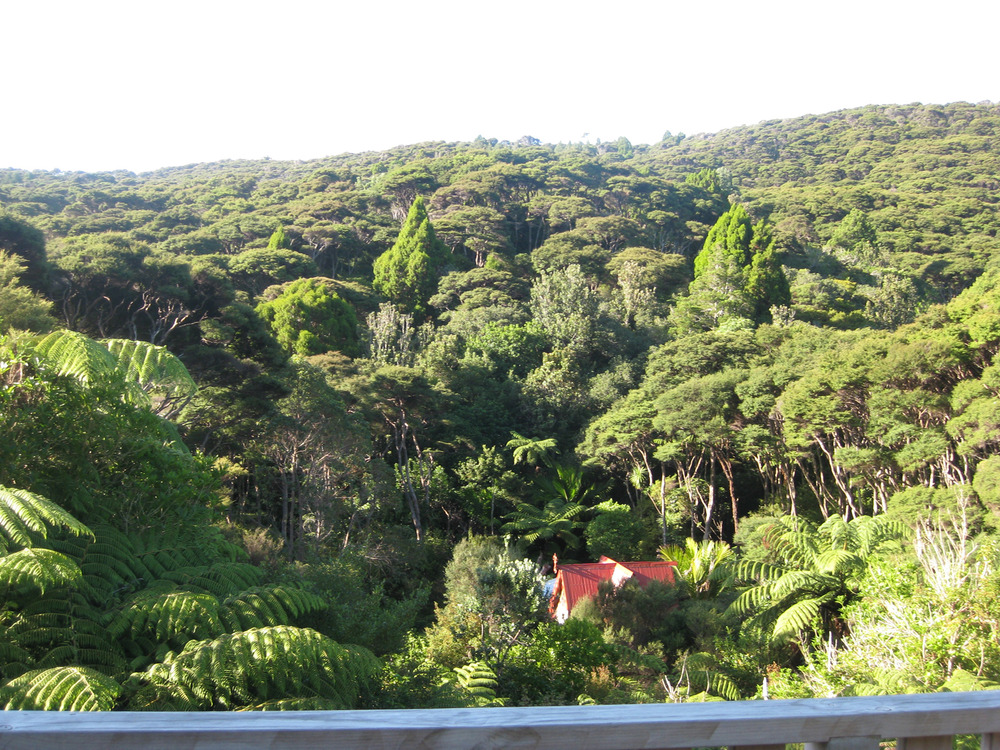
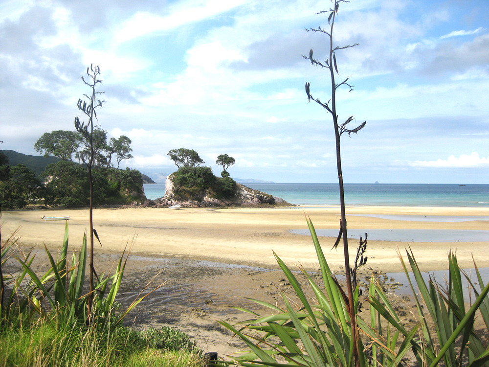
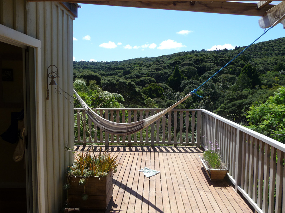
Logo and a Wordpress theme for Mischief Moose Manor, a subtropical jungle villa wide away on Great Barrier Island, New Zealand. Small functionality, easy contact and booking possibilities. The pictures of that manor are amazing. I want to book it too.
urbanvention
Corporate Design for the Berlin based startup. urbanvention is a software development company, specialized in new technologies, in the field of data mining, cloud computing and rapid prototyping. They like challenging new projects.
